DubaiData
Economic intelligence product that turns global signals into simple indicators — ready for an investor-grade brand people would actually trust.


THE CHALLENGE
What stood in the way.
The Problem
Data products often look like dashboards, not brands. DubaiData needed to feel premium and investable — not like another terminal skin.
Business Impact
Without one identity, membership offers, stationery, social, and the product site would read as separate vendors instead of one company.
The Shift
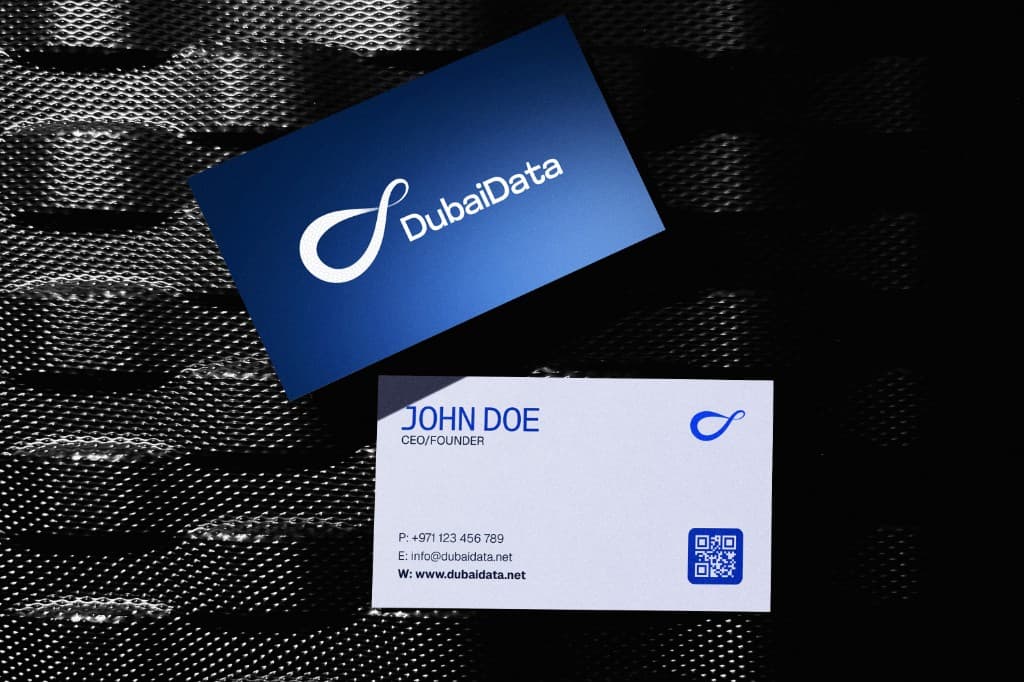
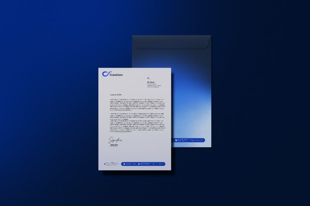
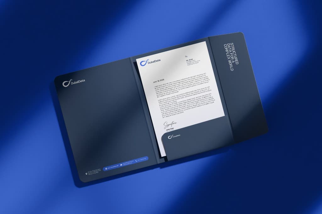
A logo pack would not travel. The brand had to hold on a business card, a letterhead, an app icon, paid creatives, and a live product page.
OUR STRATEGY
How we moved.
Foundation
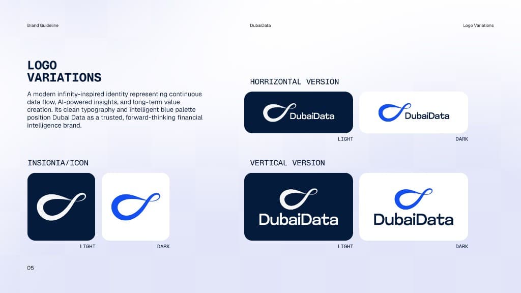
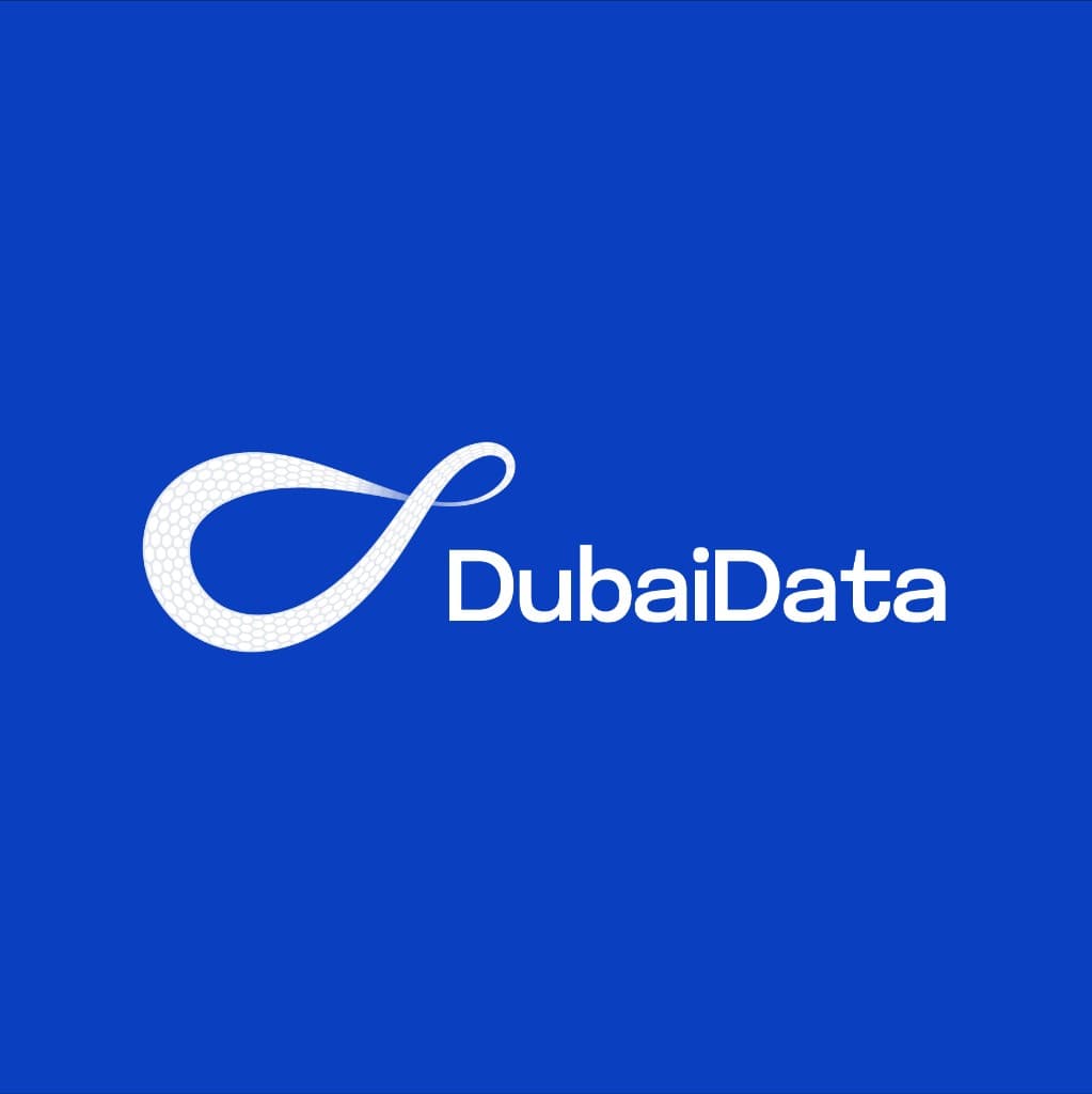
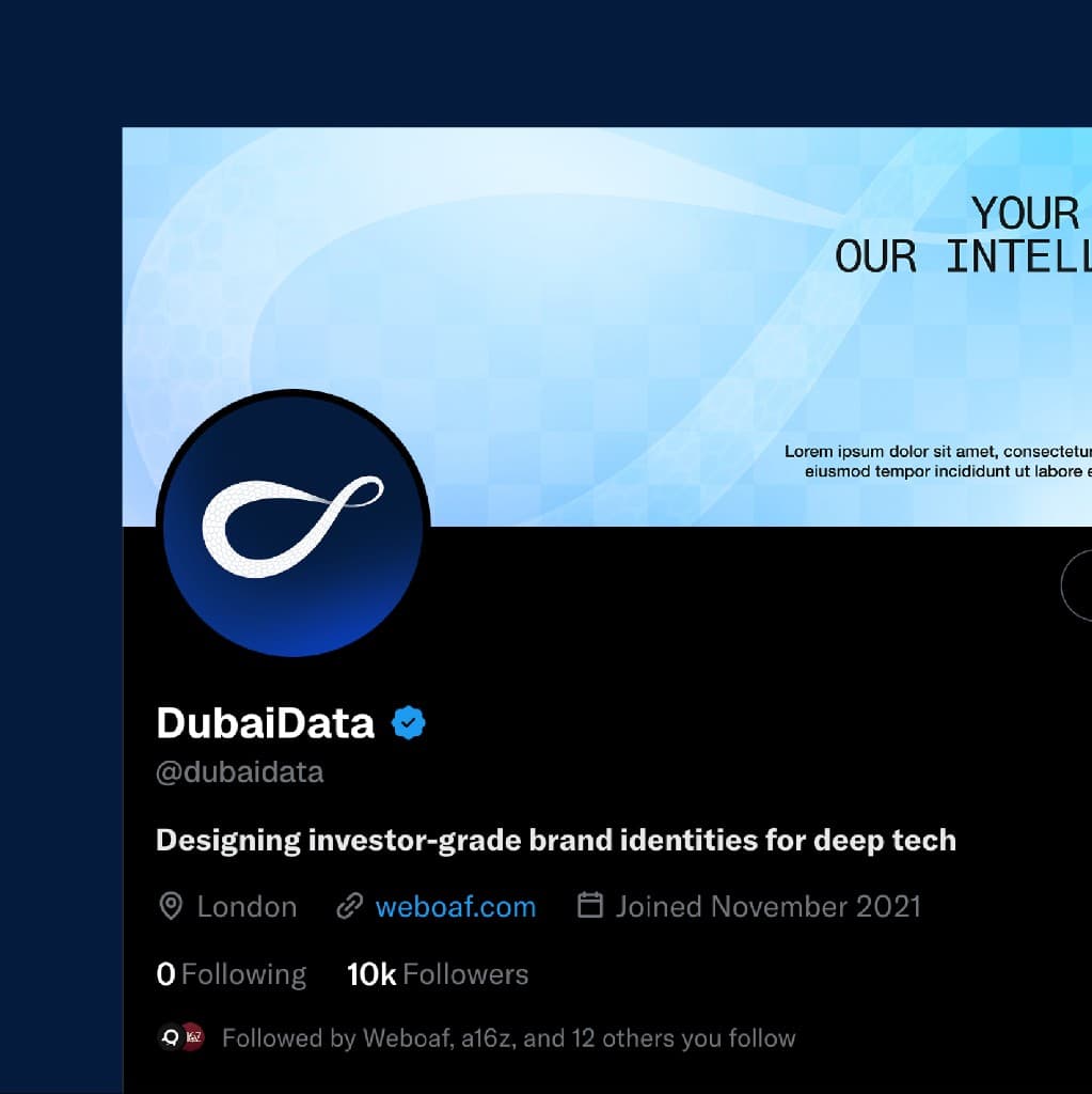
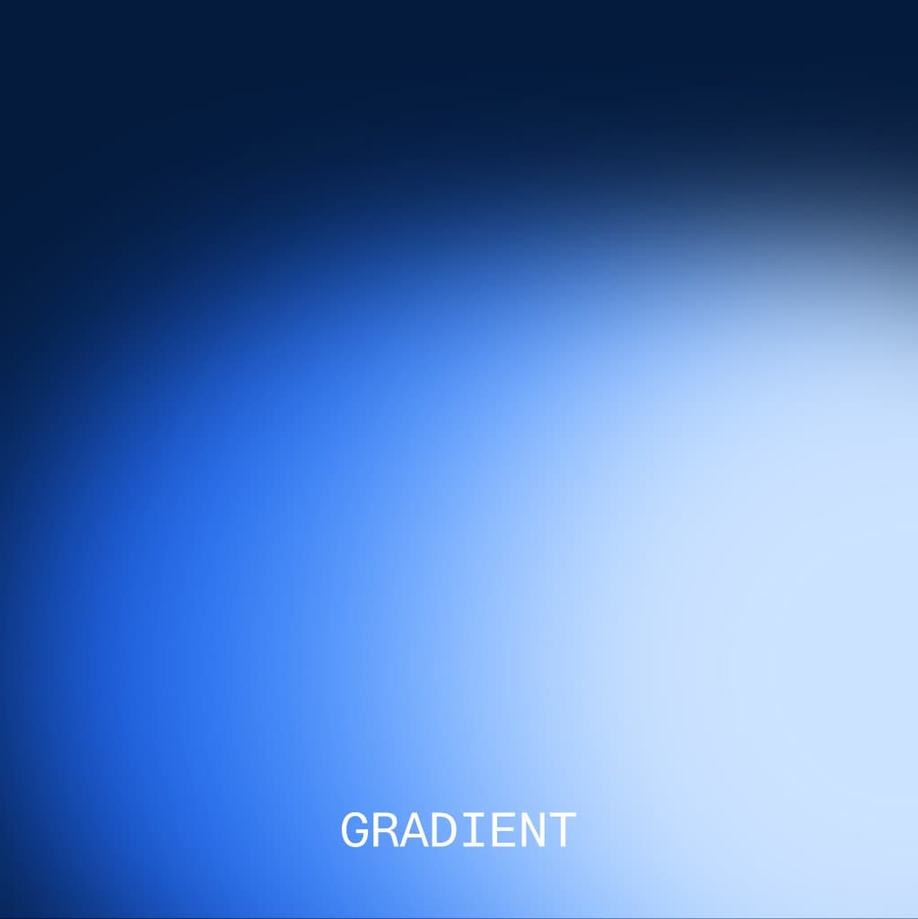
Positioning locked to structured data for a complex world. The honeycomb infinity mark, Deep Space Blue, Electric Cobalt, and Mist Lavender became the system.
Core Execution
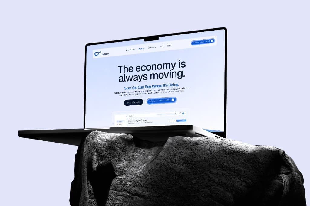
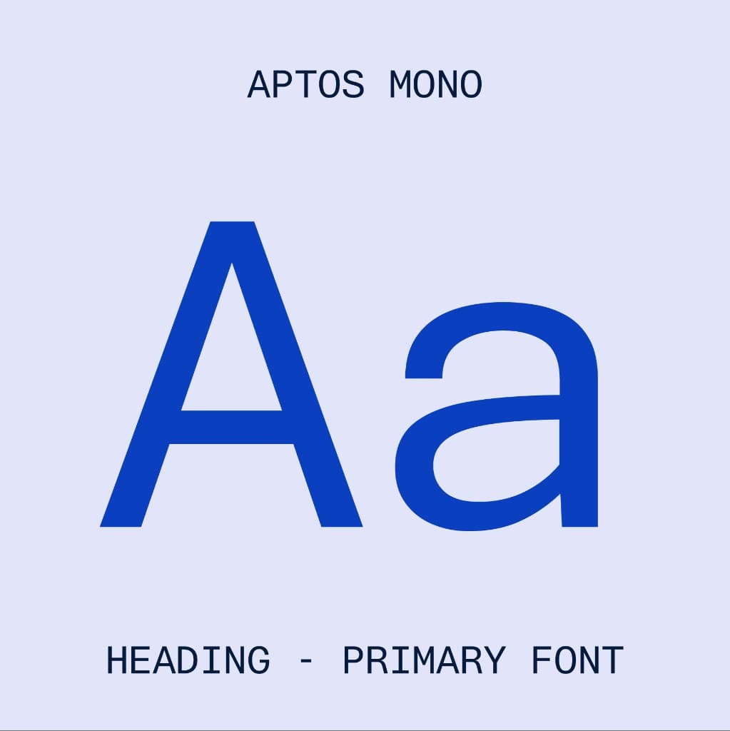
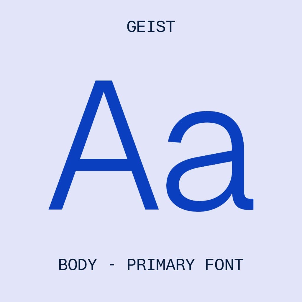
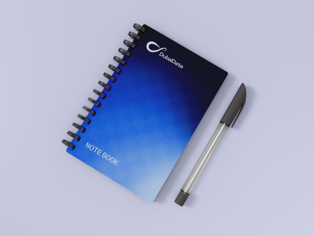
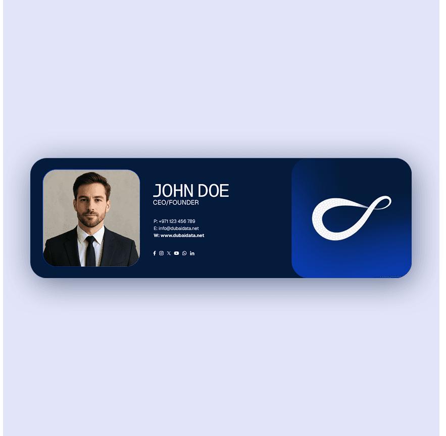
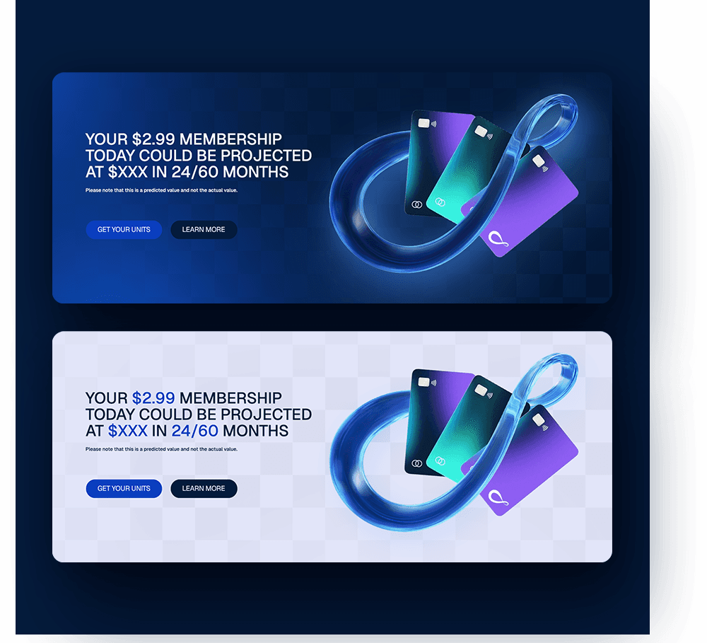
Collateral, membership creatives, and a product website shipped as one visual language — Geist for body, Aptos Mono for headings.
Motion & Presence
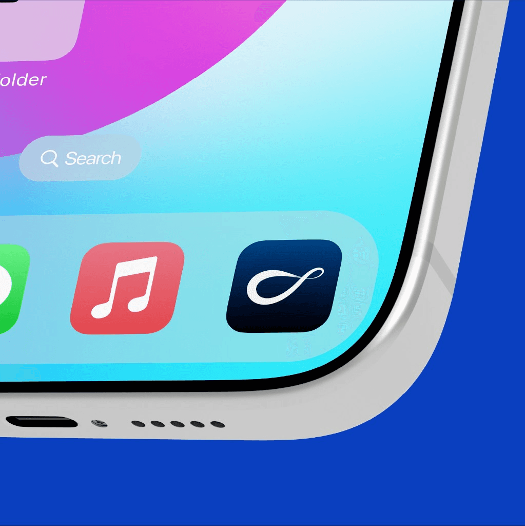
Logo film, social, and an app icon put the mark in product and feed contexts so the identity could live beyond print.
EXECUTION HIGHLIGHTS
How we executed.
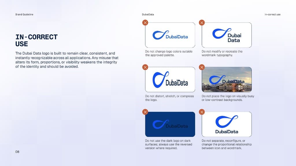
Incorrect use
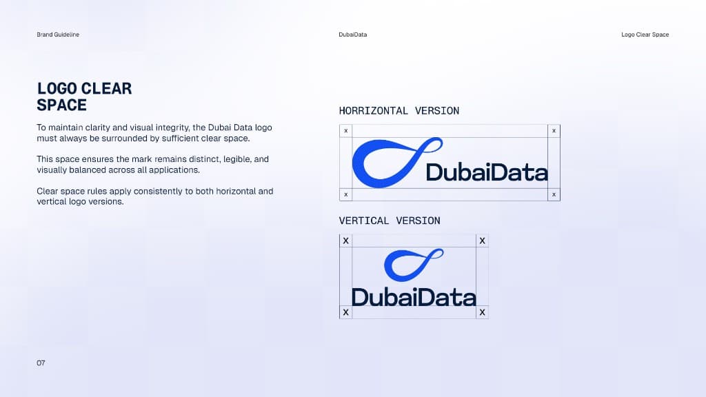
Logo clear space
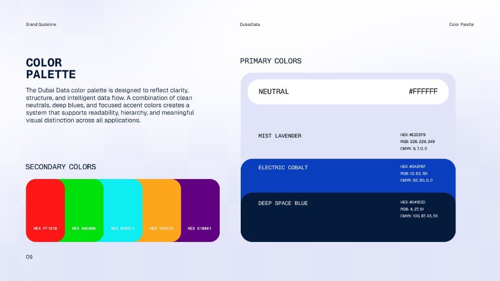
Color palette
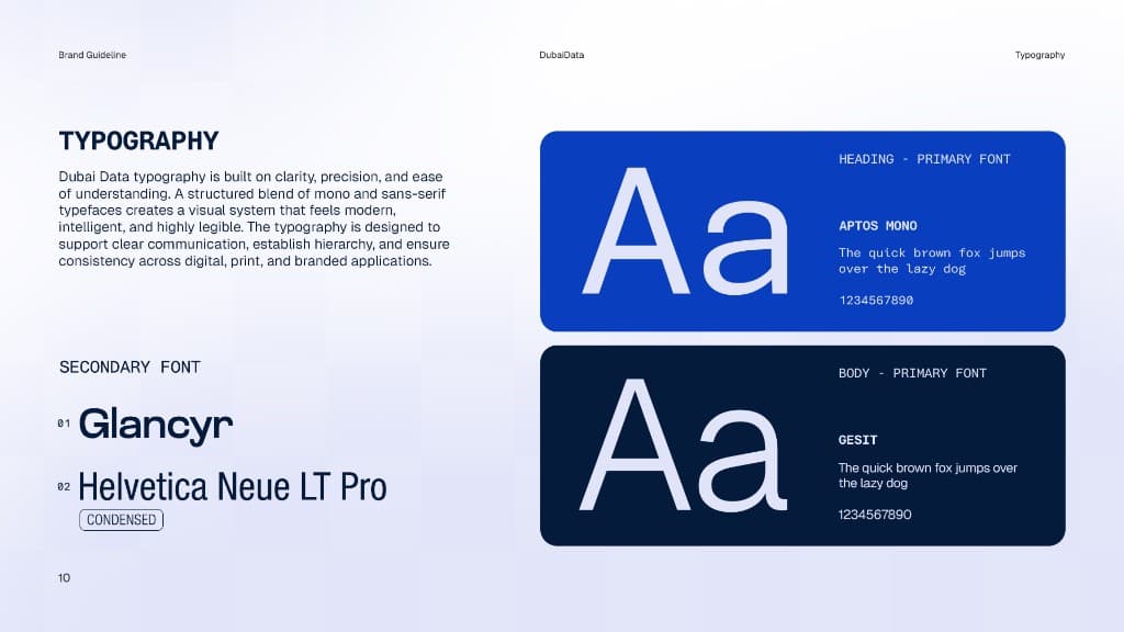
Typography
RESULTS
What changed.
0Brand touchpoints
0Core color tokens
0Typefaces
0Motion identity
KEY TAKEAWAY
Key takeaway
When identity, product UI, and collateral share one system, a data company starts to look as structured as the intelligence it sells.
CLIENT FEEDBACK
What they said.
The identity needed to look like a product people would trust with economic data — not another fintech template.
NEXT STEP
Facing similar challenges?
Let's build your growth strategy.
